1.0.0-beta.6
Rich Text Editor and Timeline components, PromptInput layout API, Resizable pixel sizing, HeroUI 3.2.0 peer dependency support and focused polish across Agenda, Rating, and scroll surfaces.
This release adds two new components: Rich Text Editor for Tiptap-based document editing and Timeline for read-only event chronology. It also splits PromptInput surface styling from layout, adds pixel-based Resizable panel sizing, and ships focused fixes for Agenda, Rating, and shared scrollbar styling. Moreover, it updates HeroUI OSS peer dependencies to 3.2.0.
⚠️ Breaking change:
@heroui/reactand@heroui/stylespeer dependency minimums are now>=3.2.0.PromptInputvariant="inline"is nowlayout="inline".variantis limited toprimaryandsecondary.
What's New
New Components
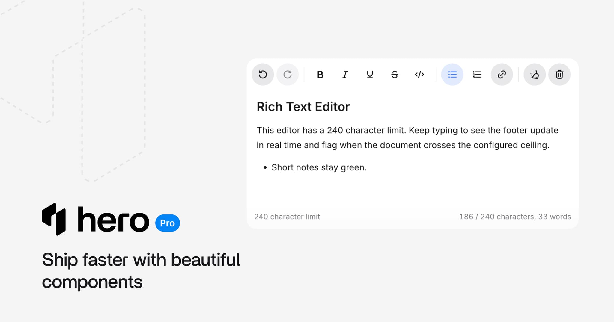
- Rich Text Editor: JSON-first Tiptap editor with toolbar, bubble menu, floating menu, and character count. (Docs)
- Timeline: Composable event-history layout for feeds, audit trails, and milestone roadmaps. (Docs)
Rich Text Editor
Tiptap-based editor with default toolbar controls, selection bubble menu, empty-line floating menu, link popover, and JSON document values.
Key features:
- JSON-first value API:
defaultValue,value, andonValueChange - Toolbar + floating menus: default toolbar, bubble menu, floating menu, and suggestion menu slots
- Character count: optional footer with word and character limits
- Extensible: custom toolbar groups, commands, and composition patterns
Controlled mode:
import {RichTextEditor} from "@heroui-pro/react";

<RichTextEditor defaultValue={documentJson} onValueChange={setDocumentJson}>
  <RichTextEditor.Shell>
    <RichTextEditor.Toolbar>
      <RichTextEditor.ToolbarGroup>
        <RichTextEditor.ToggleButton command="bold" />
        <RichTextEditor.ToggleButton command="italic" />
      </RichTextEditor.ToolbarGroup>
    </RichTextEditor.Toolbar>
    <RichTextEditor.Content />
    <RichTextEditor.Footer>
      <RichTextEditor.CharacterCount />
    </RichTextEditor.Footer>
  </RichTextEditor.Shell>
</RichTextEditor>;
Timeline
Read-only chronology for activity feeds, incident history, release logs, and centered milestone roadmaps. Use Stepper when the user is moving through an interactive sequence.
Key features:
- Compound layout:
Timeline.Item,Timeline.Rail,Timeline.Marker,Timeline.Connector, andTimeline.Content - Start + center axes:
axis="start"oraxis="center"with alternate placement - Status markers:
default,current,success,warning,danger, andmuted - Responsive centered layout: centered milestones fall back to a start-axis layout on small screens (#557)
- Accessible: semantic
ol/li,aria-currentonstatus="current", decorative rails hidden from assistive technology
Centered milestones:
Incident response:
import {Timeline} from "@heroui-pro/react";

<Timeline axis="start" placement="alternate">
  <Timeline.Item status="current">
    <Timeline.Rail>
      <Timeline.Marker />
      <Timeline.Connector />
    </Timeline.Rail>
    <Timeline.Content>
      <article>
        <h3>Canary rollout started</h3>
        <time dateTime="2026-06-15T09:34">09:34</time>
        <p>Enabled for 5% of workspaces.</p>
      </article>
    </Timeline.Content>
  </Timeline.Item>
</Timeline>;
PromptInput Layout
PromptInput now separates surface styling from layout:
variant:primary|secondarylayout:stacked|compact|inline
New demos cover compact composers and review-style layouts with attachments and queued prompts. Queue reorder handles disable when there is only one item.
Review composer:
Resizable and AppLayout
Resizable and AppLayout now document and support pixel/CSS panel sizes with preserve-pixel-size resize behavior. Panel open/collapse sync is safer when using fixed-width aside and sidebar regions.
Chat Attachments
ChatAttachment.Input now accepts pasted images, filtered by the existing accept prop.
Improvements
- HeroUI OSS 3.2.0 -
@heroui/reactand@heroui/stylesdev and peer dependencies now target 3.2.0 - Agenda - Mobile event alignment uses measured/CSS slot height for labels, scroll, drag, and the current-time indicator
- Rating - Overlay spacing uses
gapinstead of per-star padding - Scroll surfaces - Shared
scrollbarutilities across sheet, command, navbar, file tree, chat conversation, and related Pro components - Mouve theme - Success, warning, and danger tones tuned for better light/dark contrast
Dependencies
Added Tiptap peer dependencies for Rich Text Editor:
@tiptap/core@tiptap/pm@tiptap/react@tiptap/starter-kit@tiptap/extensions@tiptap/extension-link@tiptap/extension-underline@tiptap/suggestion
Install the packages when using RichTextEditor:
npm install @tiptap/core @tiptap/pm @tiptap/react @tiptap/starter-kit @tiptap/extensions @tiptap/extension-link @tiptap/extension-underline @tiptap/suggestionWe're currently working on making feature-specific peer dependencies optional. That improvement is
planned for the next release, so apps that do not use components like RichTextEditor will not need
to install their supporting packages.
Breaking Changes
Peer dependency minimums bumped
@heroui/react and @heroui/styles now require >=3.2.0:
- "@heroui/react": ">=3.1.0"
- "@heroui/styles": ">=3.1.0"
+ "@heroui/react": ">=3.2.0"
+ "@heroui/styles": ">=3.2.0"
Update both packages together:
npm install @heroui/react@latest @heroui/styles@latestPromptInput inline layout rename
variant="inline" is now layout="inline". Surface styling stays on variant.
- <PromptInput variant="inline" ...>
+ <PromptInput layout="inline" variant="primary" ...>
Rich Text Editor peer dependencies
Tiptap packages are required when importing RichTextEditor. Install the packages listed in Dependencies alongside @heroui-pro/react.
Upgrade
npx heroui-proSelect Update HeroUI Pro React to x.x.x (latest) from the interactive menu.